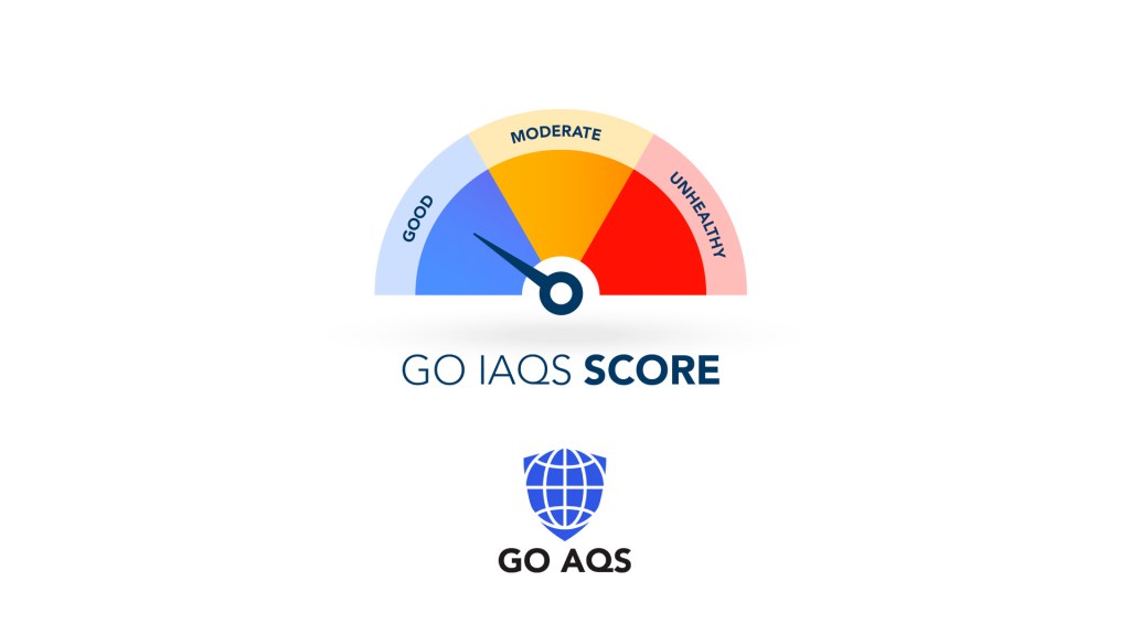
The shift from the conventional “Green” to the specific “Blue” hue in the GO IAQS Score represents a significant evolution in how we communicate environmental health. While green has been the conventional way for “Good” for decades, GO AQS has prioritized accessibility and psychological resonance over tradition.
Here is why the transition to #658eff is more than just a stylistic choice.
1. Universal Accessibility: The 8.5% Problem
The most critical driver for this change is human biology. Approximately 8% of the male and 0.5% of the female population suffers from some form of Color Vision Deficiency (CVD), most commonly Green color blindness.
In a traditional index (Green → Yellow → Red), those with deuteranopia or protanopia often struggle to distinguish between a “Good” (Green) status and an “Unhealthy” (Red) status. This creates a dangerous ambiguity in health communication. By moving to a clear, vibrant blue (#658eff), the GO IAQS ensures that the “Good” category sits entirely outside the red-green confusion axis. This makes the index truly inclusive, allowing millions of people to recognize safe air at a glance without relying on tonal differences they cannot see.
2. The “Blue Sky” Association
Psychologically, humans have a deep-rooted evolutionary connection between the color blue and the concept of “clear” air.
- The Atmospheric Metaphor: When the air is free of particulate matter and smog, the sky appears a deep, vibrant blue. Conversely, polluted air often appears hazy, gray, or brownish.
- Relatability: Using the blue #658eff mirrors the visual experience of looking up on a perfect day. It reinforces the idea that the air is not just “not bad,” but actively fresh and pure.
3. Optimized for UI: The Black & White Text Test
A significant technical advantage of the blue hue #658eff is its specific luminosity and “color weight.” Unlike many shades of green or darker blues, this hue was meticulously selected for its dual-text compatibility.
- Universal Legibility: The color is balanced enough to allow both black and white text to be overlaid with high readability.
- Design Versatility: Whether a dashboard uses a “Dark Mode” (white text) or a “Light Mode” (black text), #658eff provides enough contrast to meet accessibility standards. This ensures that the IAQ Score is always easy to read, regardless of the device or interface design being used.
4. The “Blue Space” Effect
A study compared red, green, and blue environments found that while green is excellent for “Biophilia” (the love of living things like plants), it can sometimes be visually “busy” (leaves, patterns, textures). Blue, representing the sky or water, is often perceived as a “flat” or “infinite” color, which requires less cognitive processing and allows the brain to “reset.” That is why blue was reported to maintain an “anxiety-free mind” in 83.3% of participants, whereas green achieved this in 75%.
Conclusion
By adopting blue instead of green, GO AQS acknowledges the diversity of human vision, leverages our natural psychological associations with the sky, and provides a modern, high-contrast visual that stands out in our digital world.

Leave a reply to Greggory Don Butler Cancel reply